When we learned that the Brampton Battalion would be relocating for the 2013-14 season, and that North Bay would finally be getting another OHL franchise, our first since the centennials left for Saginaw in 2002, I was pretty excited.
Growing up, my dad had season tickets to the Barrie Colts. From this experience, I learned what a pillar an OHL franchise can be for a community. Hockey brings Canadians together like few things, and when I heard we’d be getting the Battalion, I was ecstatic. My first thought was basically that it was good for the community, and hey, it would probably provide me with some entertainment. Win-Win.
My second thought was:
“I really hope they change their brand”.

No, I didn’t mind that they stuck with the name Battalion. North Bay is a community deeply engrained with military tradition, and the name and motif fits well. The alliterative flow of the name from “Brampton Battalion” even sticks with “Bay Battalion”. The name is totally fine. No, I’m talking about the logo, and …
(I’m sorry Troops diehards, this has the potential to upset you)
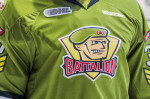
… that god-awful green.
This all might seem superficial to some degree. We get a team, and hockey isn’t about how you’re dressed, so who cares? I’m a sports fan, I certainly get this perspective. The product on the ice is what counts.
But I also like to wear cool gear from my favourite teams with pride. I’m a fan of good design. Whether you’re a Habs fan or a Leafs fan like myself (Sens fans: I just assume you’re all in hiding) you have to admit both jerseys, logos, the brands, they’re absolutely impeccable. In fact, they’re timeless. The histories of their Toronto and Montreal respectively is stitched into every thread of the Leafs and Canadiens Sweaters. They are worn with the upmost pride.
The brand of the North Bay Battalion, however, is just not good design for our modern tastes. It doesn’t have that timeless quality. And for those of us OHL fans from the Brampton Battalion days, it’s really just not our own.
For starters, let’s talk about the green. I just think its actually a brutal colour to centre your branding on. The olive/khaki shade certainly calls upon a military motif, but when it comes down to it, for everyday people who would be wearing your merch’, it’s just not a great look. Who’s wants to wear a vomit coloured green? It’s only the (very few) hardcore fans who I see wearing the jersey around town. There is very little appeal in the merchandise for the casual fan. A t-shirt that colour, irrespective of the logo its just not quite what you would call “cool”.
And it’s not hard to imagine the jerseys look a hell of a lot better with a simple tweak of the shade of green. After googling shades of green, I think something like a Basil verging on a forest green, would look much better while still maintaining a military feel. The below mockup, while not my proposal for the teams next jersey, just gives you an idea of how a different green can really change the identity of the brand.

Much, much better right? So, a tweak to the green and all of a sudden you have a jersey that looks much sharper.
Now about the logo. Once again, the military motif is fine, it’s the execution that flounders. Modern logos aim to be sleek, and often minimalism is a more effective form than the charcuterie style on the current logo. And yes, character style logos definitely dominate the OHL team brands (see Charlie-Horse on my beloved Barrie Colts logo), but the current logo, basically, a guys face, is just not something I’d ever want on a t-shirt or a hat. Given how little Battalion merchandise I see around town, I think it’s fair to say others agree with me.
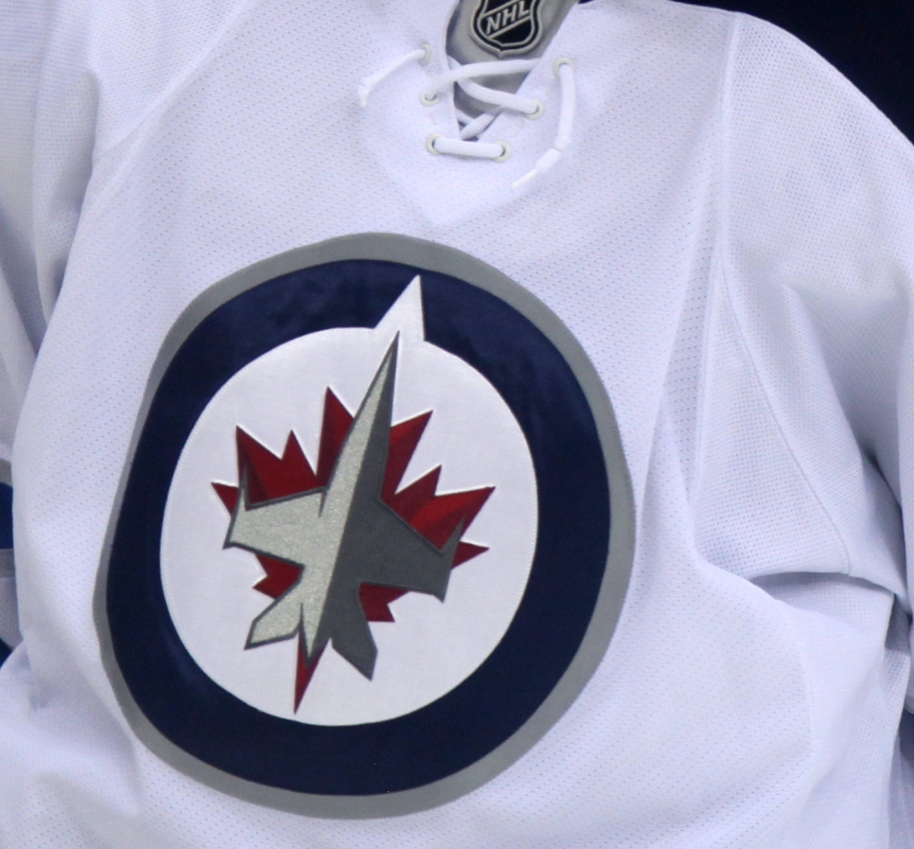
Consider the Winnipeg Jets’ logo, which manages to pay homage to the airforce without appearing tacky in the least. It’s sleek and appealing, and has been an effective brand since the relocation of the Atlanta Thrashers to Winnipeg in 2011.
Since the great OHL finals run the Battalion had in their first season in North Bay, attendance has steadily declined year over year. Honestly, I find the games to be affordable and entertaining, it’s good hockey. I really don’t go often though, once a year probably. Speaking for myself, a rebrand would really drum up more interest from casual fans like myself, and would likely cause some excitement about the team locally, especially if the merchandise is appealing.

That’s not to say the team won’t need to be a lot better than they were in the somewhat mercifully cancelled 2019-2020 to put bums in the seats. Just that people around town talking about your new logo, excitedly anticipating your new merchandise, and proudly wearing it around town is nothing but advertising for ticket sales.
The Toronto Blue Jays rebranded in 2012, unveiling a logo that combined elements of the teams history with a sleek modern design. You might remember that the hats donning the new logo became a huge fashion trend Canada wide, were sold out everywhere seemingly forever, and reinvigorated dwindling interest in the team with a younger demographic. Obviously a rebrand of the Battalion isn’t going have national style implications, but it could certainly help make the team cool around the city again.
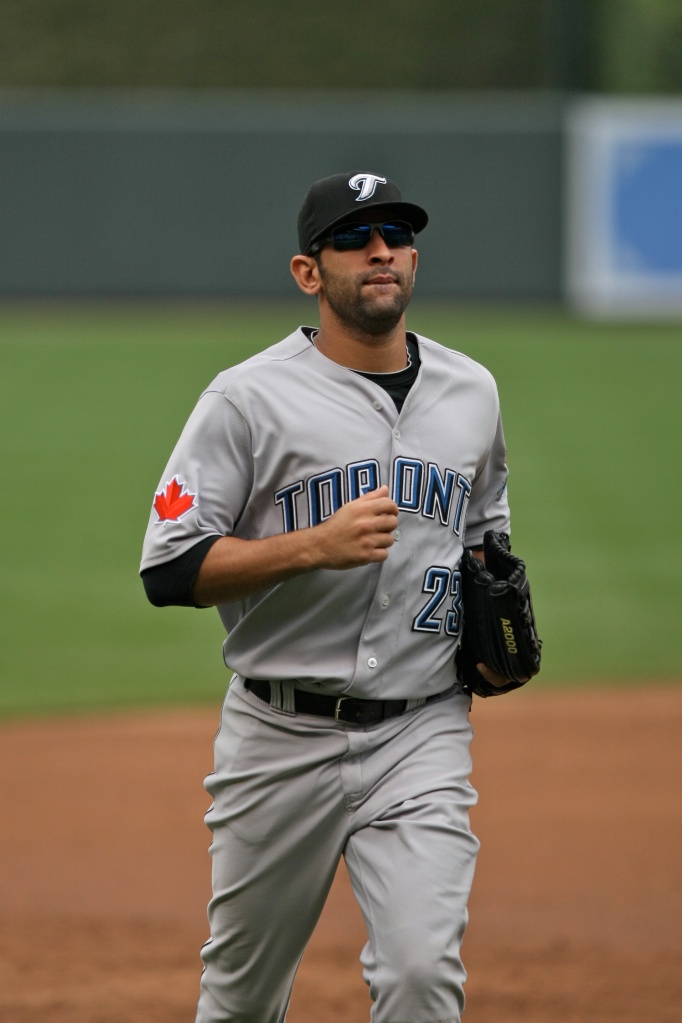

Jose Bautista in both the pre (left) and post(above) rebrand Jays jerseys. I think it’s pretty unanimously agreed this was a HUGE upgrade.
In terms of a new logo, there are some options to maintain the military themes while adopting a more minimalist style logo. One might incorporate inspiration from the Moose theme of logo of the local Algonquin Regiment (see below), or simple elements which call to mind the theme, such as military vehicles, army boots or helmets, weaponry etc. While the airforce wouldn’t be necessarily broken up into “battalions”, the aviation theme from the CFB North Bay base might also localize the logo.

Honestly, even a word style alternate logo, either with “North Bay” or “Battalion” or both in an impactful font, coupled with a deeper green would make for a fantastic 3rd jersey which could drive some merchandise sales and promote the brand.
Really, the biggest mistake here, to me, would be to continue with the current branding. It’s not uniquely North Bay, it never was, and I think even those few who really like the current brand won’t mind some reinvigorated interest and some new merchandise to support their Troops.
I can’t pretend to be an expert in logo design, but I do know that the teams current logo doesn’t work well for merchandise. Timing wise, with the news that the Battalion have the first overall pick in the OHL Entry Draft, and concern about the dwindling attendance to Battalion home games, the organization should seriously consider a rebrand to reinvigorate local interest in the team.
Hockey fans in North Bay know that they can’t afford to lose another franchise. The reality is we don’t get a third shot at this, and the franchise should be doing everything it can to endear itself to North Bay hockey fans, and this includes producing some cool merch’ that fans can get excited about and wear with pride.
RM
If you enjoy The Gateway’s articles, throw us a follow on instagram and twitter, or like our facebook page.
If you want to wake up with the latest Gateway content in your inbox, be sure to subscribe!
Do you agree? Am I out of my mind? Let me know what you think about the teams current brand below:

Yes Yes Yes We need an new identity that promotes North Bay and the current green is not appealing. You’ve made the argument a very valid one for a change that will give new visual identity for the team and fans, I hope they rebrand.
LikeLike
Thanks for your thoughts Christine!
LikeLike
..great view on the Battalion brand…a Casey type mascot..Sarge has improved the act lately so changes is possible but Mr Abbott does not allow #s over 32..maybe Fantilli could force that issue but there is no way A will change the theme….I will not wear that colour/logo in any way shape or form let alone hats/sweaters/hoodies….his redemption policy has not changed so this would be a gigantic leap for him…that fall from the box would hurt…..I would love to see MacLellans view is…if he is still there after attendance drop since his employ.
LikeLike
Your mockup Jersey is well fugly.. A better colour would be a two or three tone camo pattern.. Agreen camo for home and a white/grey winter camo for away.. As for the face of “Sarge” for the logo, ok I’ll say to maybe, maybe change that to an image of a Churchill Tank or a more modern Lav2 Coyote fighting vehicle.. Stylized writing or letters is bland, The image if Sarge is better..
LikeLike
Hey everyone’s got an opinion,
Thanks for sharing yours!
LikeLike
Yes I agree I think its time for a rebranding. or a new third jersey.
LikeLike
No, I do not think we need re-branding. Our logo and sweaters are unique and represent our franchise. What we need is the continuous improvement that we saw in the final 15 games. Keep up the great rebuilding job and we’ll be playoff bound next year…
LikeLike
If the logo and sweaters represent the franchise, the franchise might want to pretend to be a cooler version of itself!
As for the last part of your comment! I agree, they finished strong, and get the first overall pick, there are better days ahead!
Thanks for your thoughts Guy!
LikeLike
I agree and always have thought that the uniforms would be changed eventually.I would buy merchandise that has a better look and yes it would get people of North Bay talking it up and yes it would be a added hype to hopefully our franchise player for years to come.
LikeLike
Perhaps a new logo. Perhaps new colour scheme… not sure about that green (its ok)…. if you change the logo, maybe it’s to make it look a little more professional and less cartoony. I love the jerseys and the logo as is but if it’s to change I think making it look more like a NHL style logo, something that will not rejected or fizzle after couple years and want the original back (ie – Blue Jays)
LikeLike